THE CHALLENGE
At its core, EMS has always been focused on providing the consumer with outdoor gear, education and local knowledge. However, its identity, ethos and personality had become diluted over time. The logo had morphed into a shell of its former self and the imagery and graphics felt dated and tired.
THE SOLUTION
As creative director, I was excited to take the brand to the next level. This included revitalizing the imagery, refining the message, developing the tone of voice and creating a logo that better represented the storied EMS heritage and their rugged customer.
First we had to breath new life into the EMS identity while paying homage to its past.
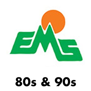
In the logo evolution above, you can clearly see when the design departed from the original look and no longer had anything to do with the outdoors. Below, the new logo feels like a proper evolution of the brand and incorporates a blue wave to acknowledge the water sports component of EMS.
GET LIT
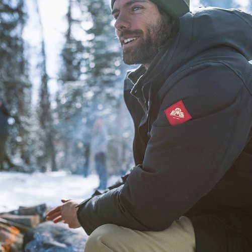
The images needed to be bold and beautiful. The tone of voice had to match our customer's vernacular and authenticity.
CALLING
ALL
DIRTBAGS
Then we put it all together.
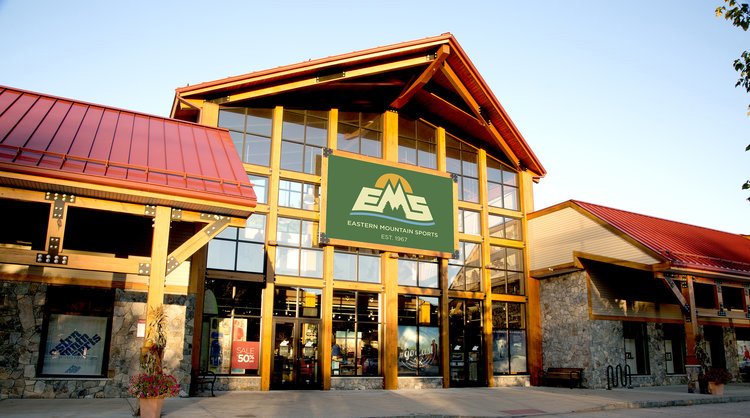
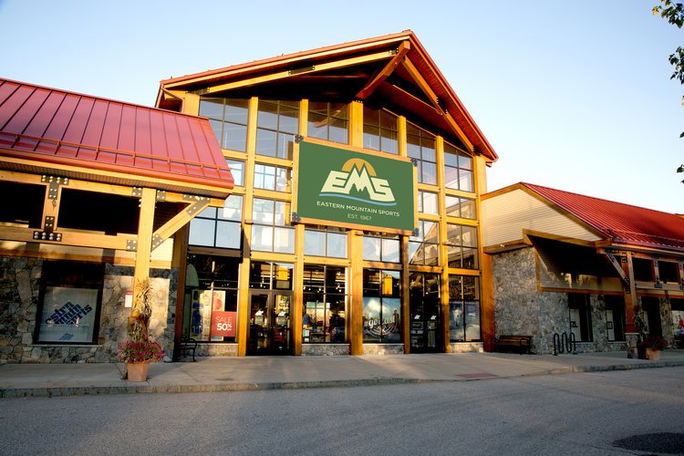
EMS’s new identity was woven into everything we did. It touched every aspect of the customers ecosystem including web, social, stores, EMS schools and of course our community.
And the new logo went on just about everything.


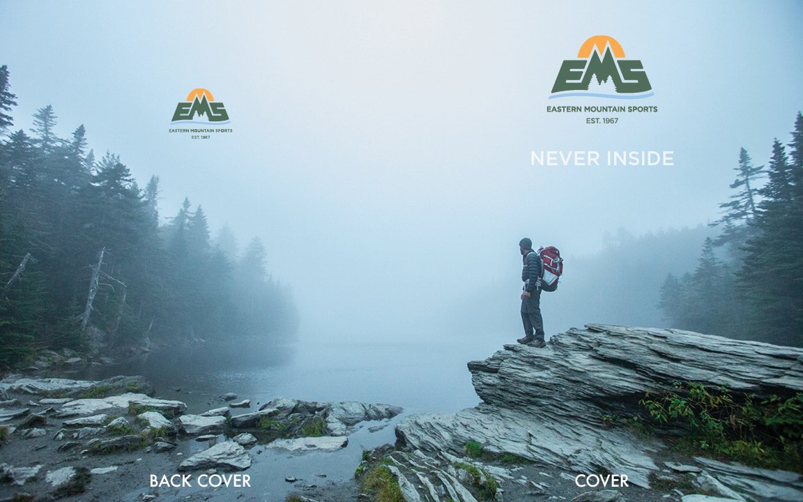
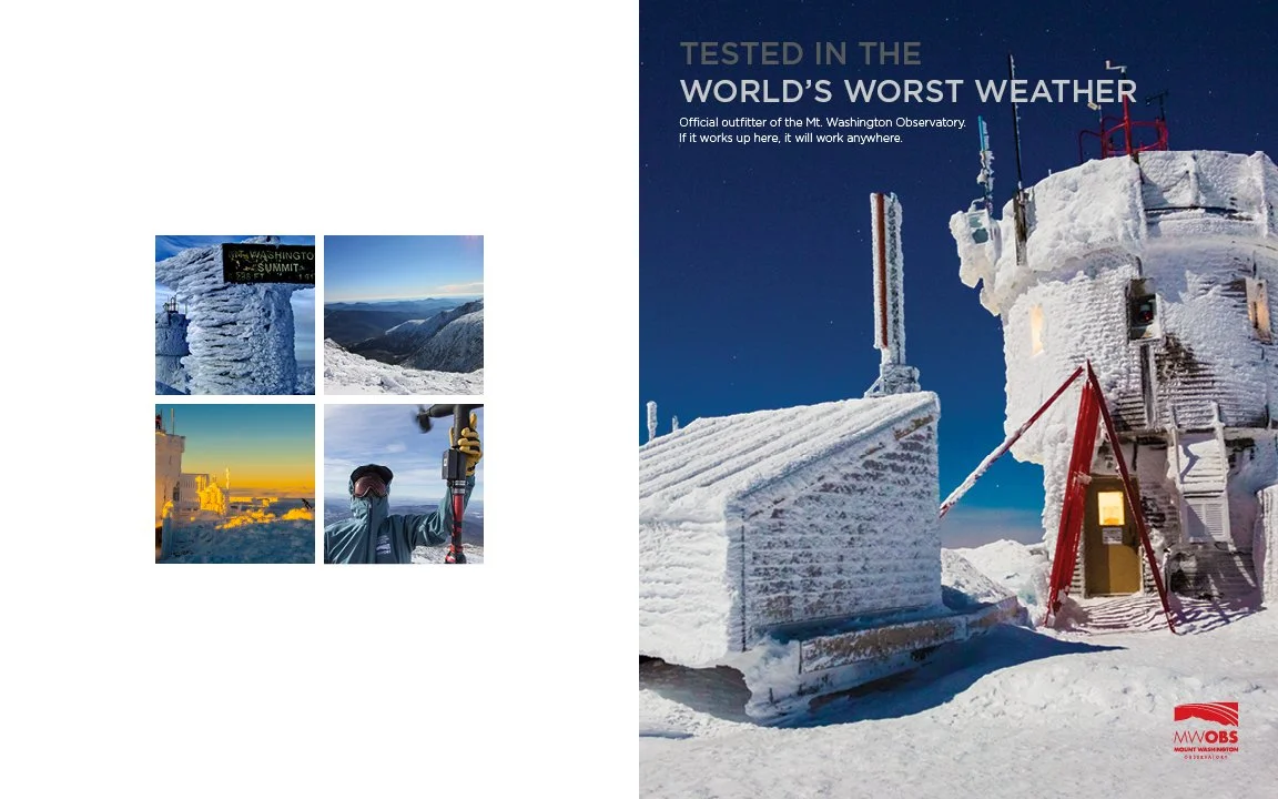
Just for fun, I also included the EMS Brand book, which served as a vital tool used to align cross-functional teams and create a rally cry for store staff and customers. It is presented as reader spreads below in order to provide a better viewing experience. Enjoy.
